The Problem
Managing projects using multiple applications was inefficient and time-consuming
Forest Service employees had to create the same project in three different tools to manage different aspects of it, like budgeting and approvals. They wanted a more efficient way to locate project information, manage new and existing projects, and view all approvals and comments in one place for every project. In short, they wanted a new application that allowed for one unified flow for project management.
Design Strategy
This was a complex application with multiple steps and built-in collaboration.
I joined the project a few months after it started, so discovery work had mostly been completed by another designer. I started by reviewing interview transcripts and the project requirements documentation to determine what information we had and to begin to scope out the design requirements for this new application.
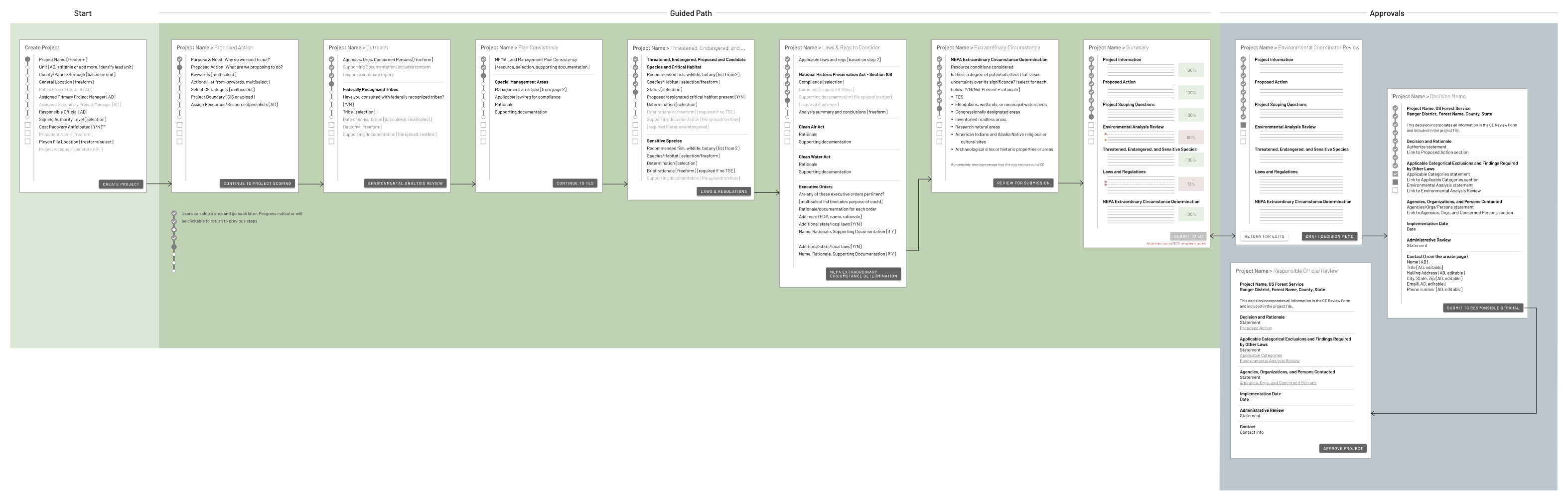
I created a flow showing where various stages of the project management process could be added or edited within the application. Because this application was for internal use by employees who were already very familiar with the tasks they needed to do, there was no need to break down the project entry using a one question per page approach. We needed to design it so the steps made sense and asked all relevant questions together so the flow was cohesive and intuitive.
Design
Low fidelity wireframes and prototypes to test the flow
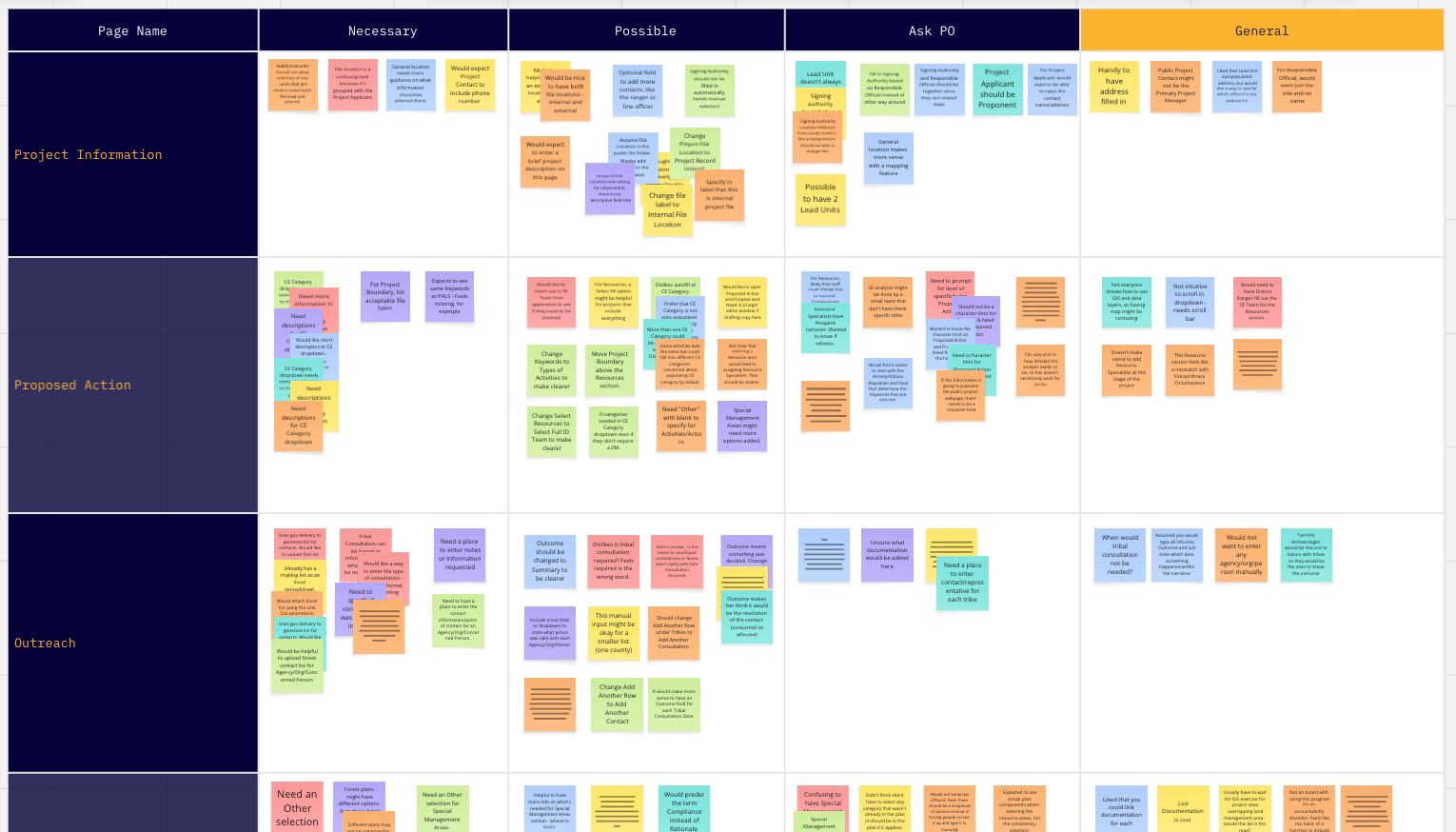
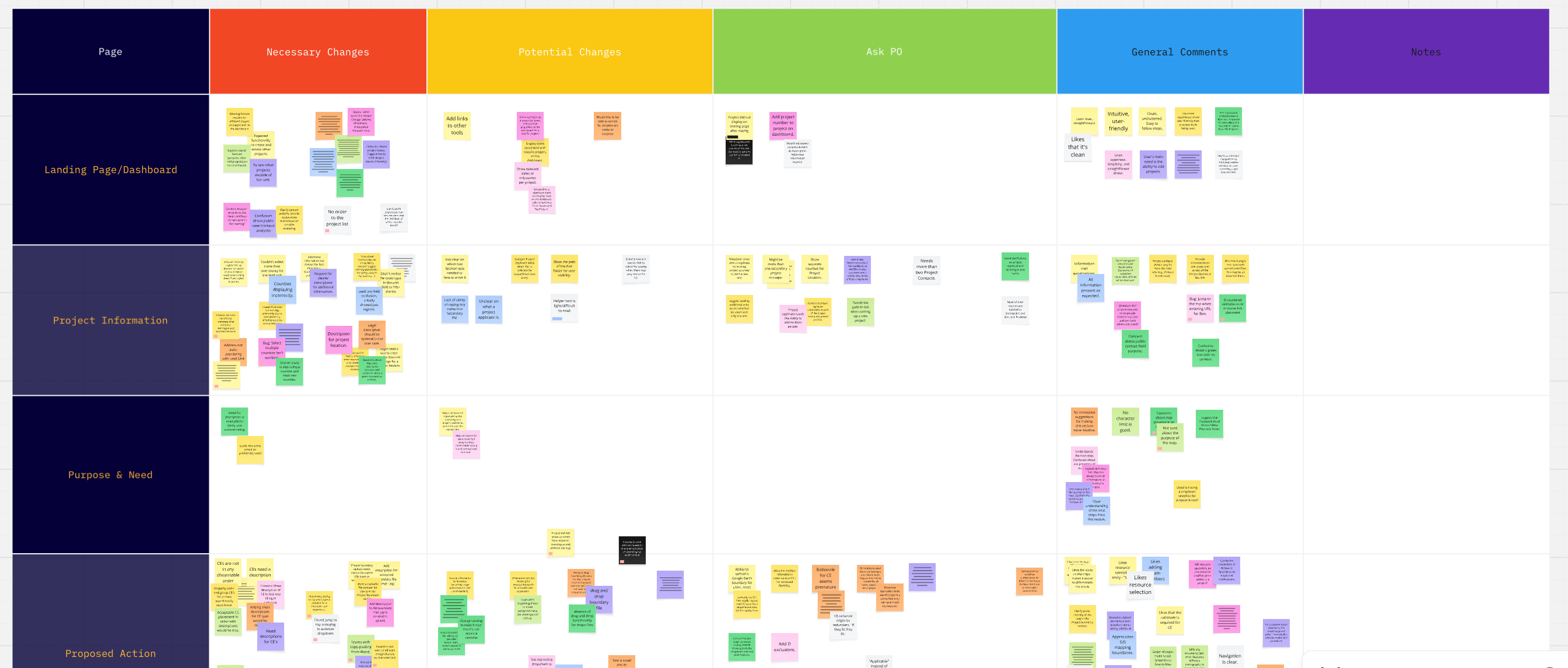
We agreed on an approach to design one section of the application at a time to hand off to engineering, and began by working on some low-fidelity wireframes to lay out the pages. These low-fi pages were shared as a prototype with multiple SMEs as well as the product owner.
There was a lot of feedback, mostly around organizing the pages into steps that made sense for the various roles accessing the application. For example, we originally combined the Purpose and Need statement with the Proposed Action statement since they were directly related to one another, but through this initial testing, we found there were people who would need to read and edit the purpose and need statement, but not the rest of the project, so it made sense to move that question into its own step, making it easier to find and comment on or edit.
-
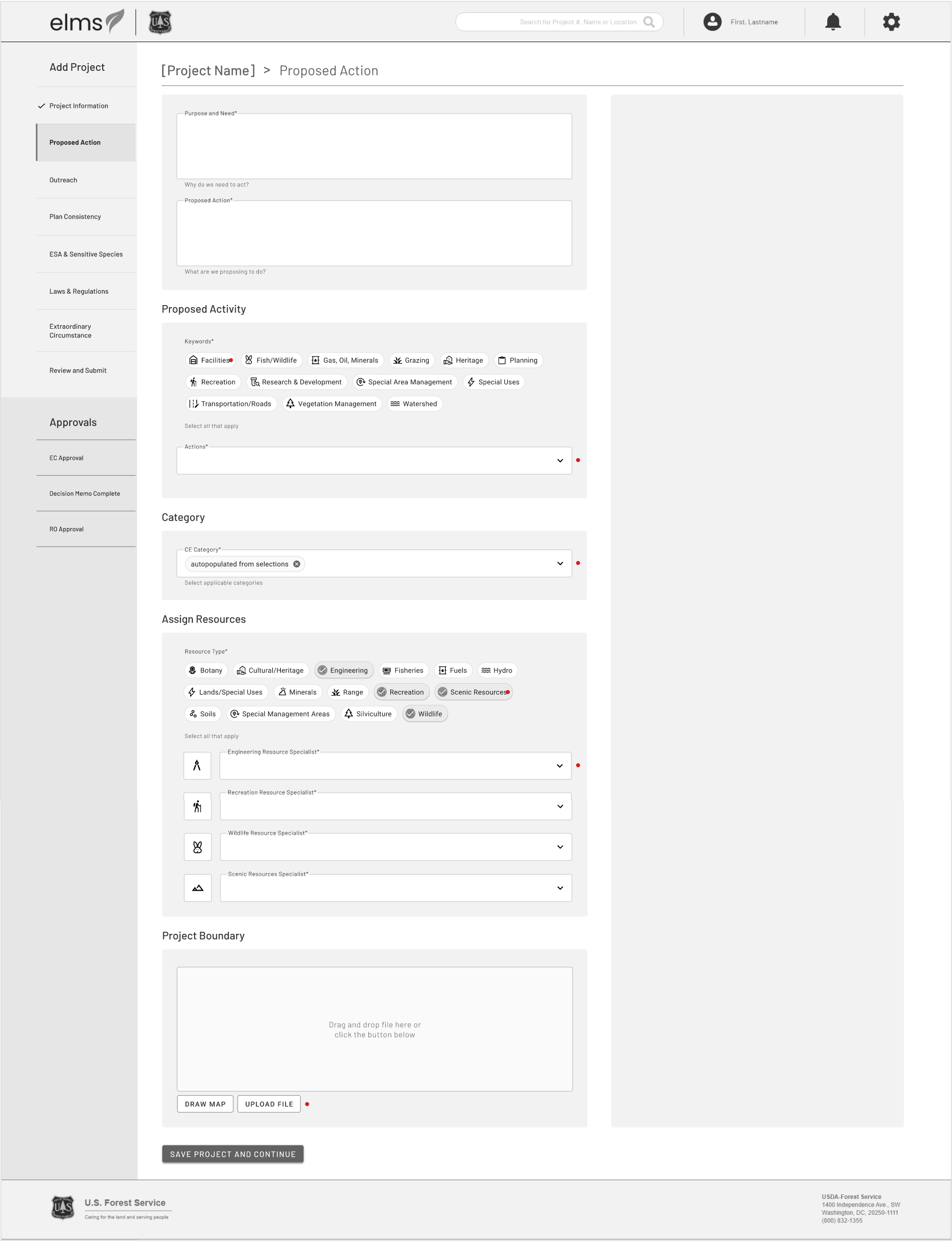
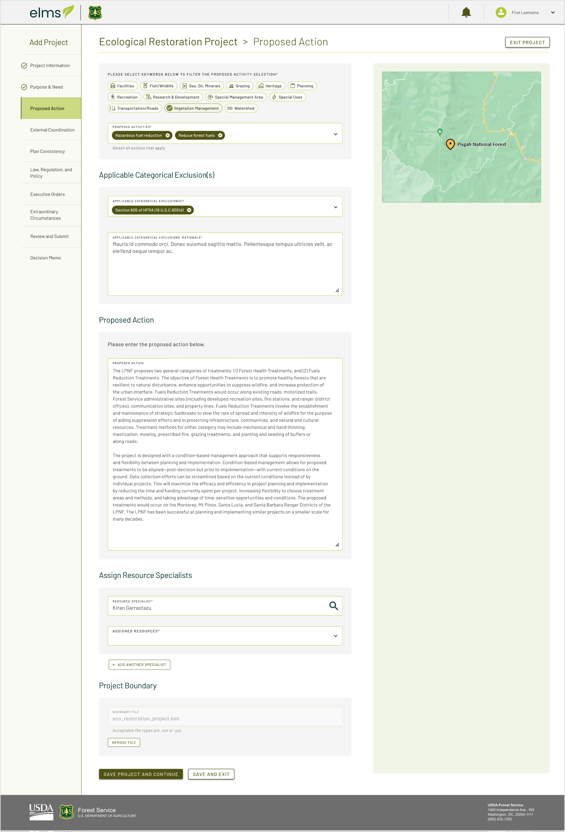
Proposed Action mockup
-
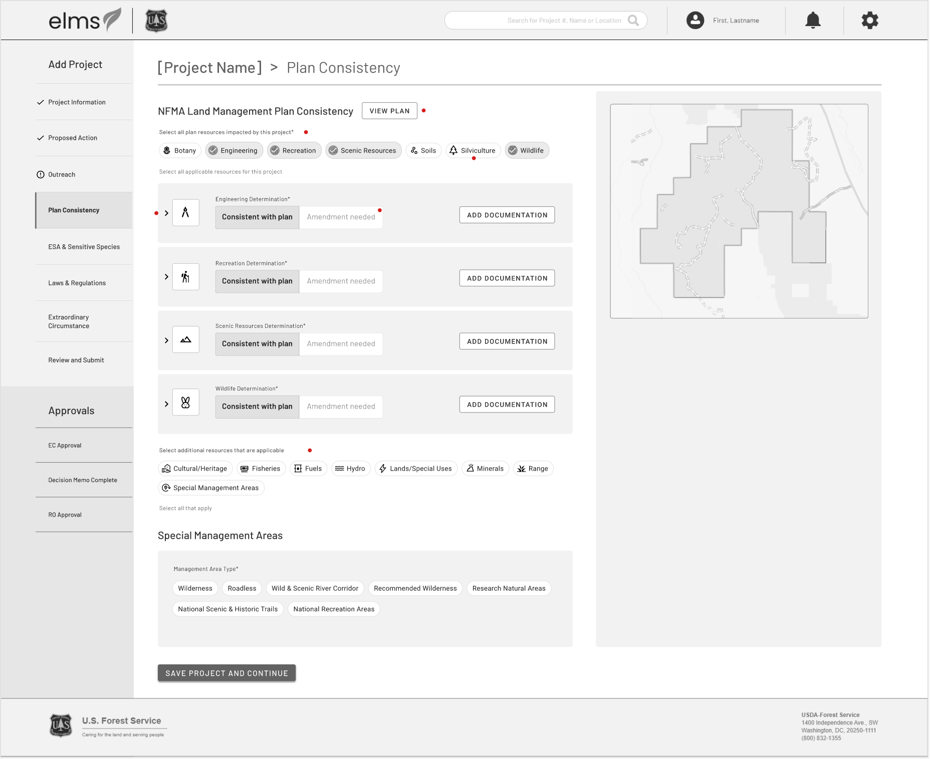
Additional form page
Preliminary User Testing
One-on-one interviews with project managers and specialists
We incorporated the feedback we received into a testing prototype. We tested this in one-on-one interviews with multiple project managers and specialists who would need to use the application. Our preliminary flow was validated, but we received additional feedback on several of the steps. For example, most users said they would upload a spreadsheet for endgangered or sensitive species, so asking them to input this information separately was tedious.
We synthesized and reported out our findings, then discussed recommendations with the product owner.
Challenges
Finalized Designs
High fidelity mockups and handoff to engineering
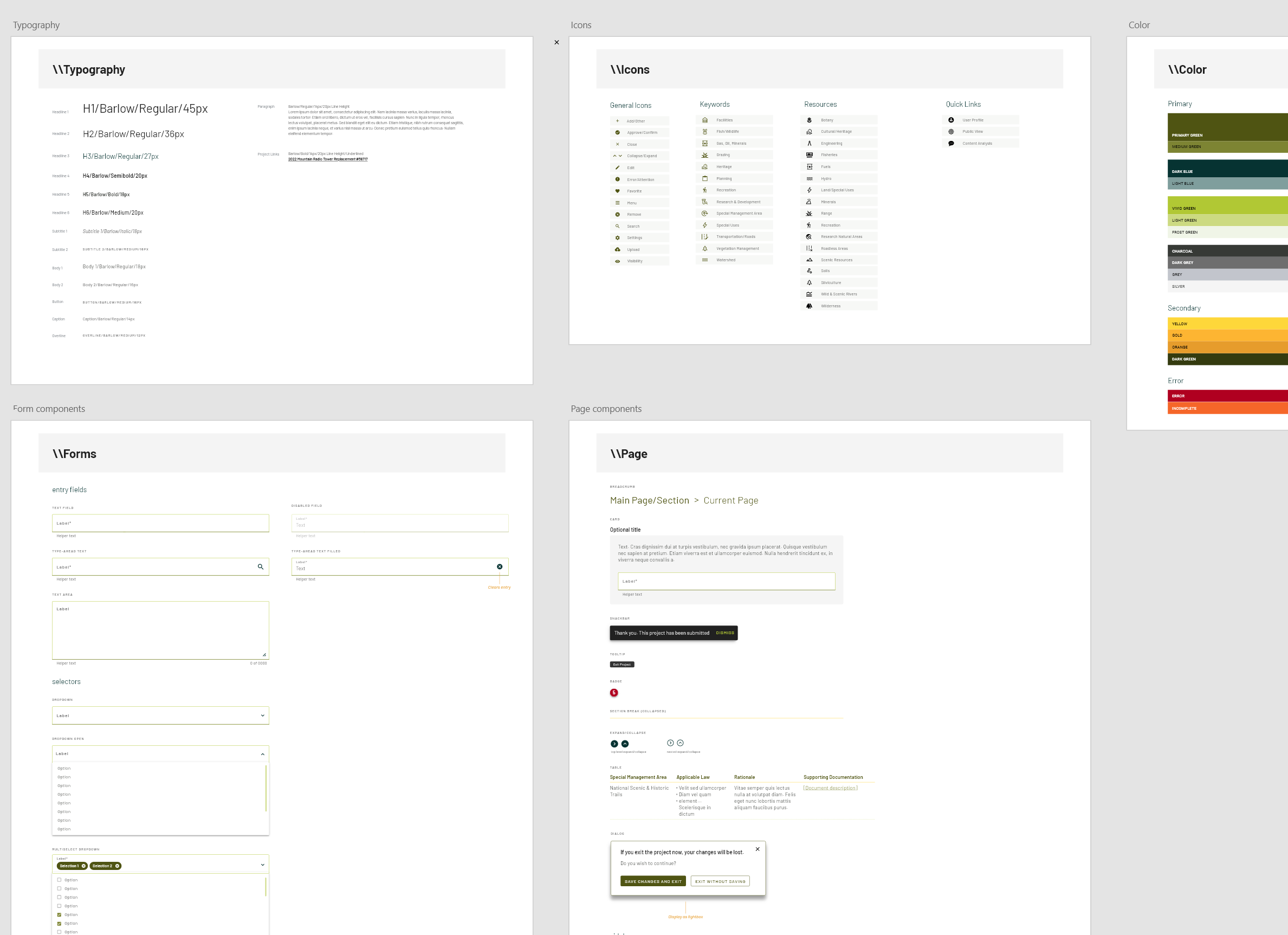
After testing, we were able to finalize designs that incorporated feedback from both the usability testing and the current product owner, which were then handed off to engineering. We also created basic components as a simple design system so the engineers could reuse elements on multiple pages.
-
Proposed Action final design
-
Components and styles
Usability Testing in staging
We tested the full flow one more time before release
Once the pages were built and in a staging environment, we were able to test one more time with a new group of specialists and project planners. Testing was positive overall. Any design issues raised were written up and planned as future improvements.
Results
In a survey, most users rated the application 4 out of 5 or higher
We released the beta version of the application to overwhelmingly positive response and continued iterating to incorporate more advanced features.